Are you looking to add a touch of retro charm to your designs? Look no further than this great collection of FREE groovy 70s fonts. Whether you’re designing a poster, creating a logo, or crafting an eye-catching invite for a retro 1070’s party, the right font can make all the difference.
Why 1970s fonts are still popular today
Despite being over 50 years old, 1970s fonts remain popular in contemporary design. This is partly due to the resurgence of retro and vintage design trends in recent years. But it’s also because these fonts have a timeless appeal that transcends their era. They evoke a sense of nostalgia and playfulness that resonates with people of all ages.
Another reason for their popularity is their versatility. 1970s fonts come in a wide range of styles, from funky disco-inspired lettering to psychedelic bubble fonts. This makes them suitable for a variety of design projects, from posters and logos to social media graphics and website headers. If you’re looking to inject some personality into your designs, 1970s fonts are a great place to start.
Groovy 70s fonts for free download
Aren’t they just fabulous?! I’ve compiled a list of my absolute favorite 70s fonts that you can snag for free.
Simply click on the link of the 70s font you like and it will take you to the site where you can get the font. Select download and the font is yours!
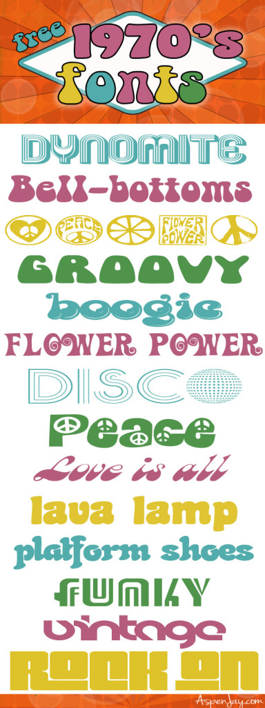
Dynomite: Mexcellent
Bell-Bottoms: Bellybeans FG Regular
70’s symbols: Hippy Stamp Font
Groovy: Mama Regular
Boogie: Kingthings Lickorishe
Flower Power: Action Is
Disco: Disco Diva
Peace: Peace
Love it all: Brandy
Lava Lamp: Coaster
Platform Shoes: Neptun CAT
Funky: Adriator
Vintage: Eyelevation Pro
Rock On: Pincoyablack
Tips for pairing 1970s fonts with other typography
Now that you have a 70s font that you love, how about pairing it with a complementary font or two to help create a more dynamic design? Here are a few tips to keep in mind when choosing fonts to pair with your 1970s font:
1. Choose fonts with similar x-heights
The x-height is the height of the lowercase letters in a font. When pairing fonts, it’s important to choose ones with similar x-heights to ensure that they look balanced together. If you pair a font with a much larger or smaller x-height than your 70s font, it can create an awkward visual contrast.
2. Contrast serif with sans-serif
If you’re pairing your 1970s font with another font, try choosing a complementary serif or sans-serif font. Serif fonts have small lines at the ends of their strokes, while sans-serif fonts do not. This contrast can create visual interest and help your text stand out.
3. Keep it simple
When pairing fonts, it’s important to keep the overall design simple and cohesive. Try to limit yourself to two or three fonts at most, and make sure that they work well together. Avoid using fonts that clash or create an awkward visual contrast.
What will you be using these free 70s fonts for?
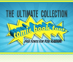
Want more fonts? Take a look at these fun comic book fonts!

Never mind! I hadn’t scrolled down far enough! I found them!
Hooray! 🙂 Glad you found them!
I’m sorry. I can’t figure out how to get to the Downloads! When I click on any of the fonts in the image, it takes me right back to the image! What am I doing wrong?
I’m learning to make mosaics, and if I can use these fonts in my designs, I’ll be so happy.
Hi Dominique!
That would be a fun mosaic! Great thing about these fonts is they are all free! So have fun! 🙂
Thanks – I intend to. 🙂
These are awesome! They are perfect for our upcoming Scholastic Book fair…the theme is Peace, Love & Books!
PERFECT! That is awesome Angie, so glad they are fulfilling a fun purpose! 🙂 Thanks for letting me know!
What fun finds! These totally just made me think of Scooby Doo…